Helping Australians shop with ease
App & Web design
B2C
eCommerse
Overview
At its core, this project wasn’t about filters—it was about trust. When Australians shop online, especially on a platform like Catch with 8M+ products, they want to feel in control. Aussies want to find the right thing quickly and feel good about their purchase. But the search experience was getting in the way.
I led a cross-functional initiative to rethink Catch’s filtering experience across web and mobile, addressing inconsistency, poor discoverability, and high drop-off rates. Over three months, we redesigned the filters end-to-end — improving usability, accessibility, and ultimately helping customers find what they want faster and with more confidence.
Services
UX design, UI Design, Design Systems
Client name
Wesfarmers
Results at a glance
+$16.5M incremental revenue
18% lift in conversion
Drop-off reduced from 48% → 27%
Consistent, accessible experience across web and mobile
Faster path to purchase, validated by qualitative and quantitative data
Solution
A unified, glanceable, and accessible filtering system that empowers customers to quickly refine their search, no matter the platform.
We introduced a simpler visual hierarchy, grouped filters by intent, added search within filters, persistent states, and clearer selections. On mobile, we redesigned the flow for one-handed use with progressive disclosure—minimising clutter while surfacing the most relevant options first.
The result was an interface that felt fast, intelligent, and aligned with the way people actually shop.
The Problem
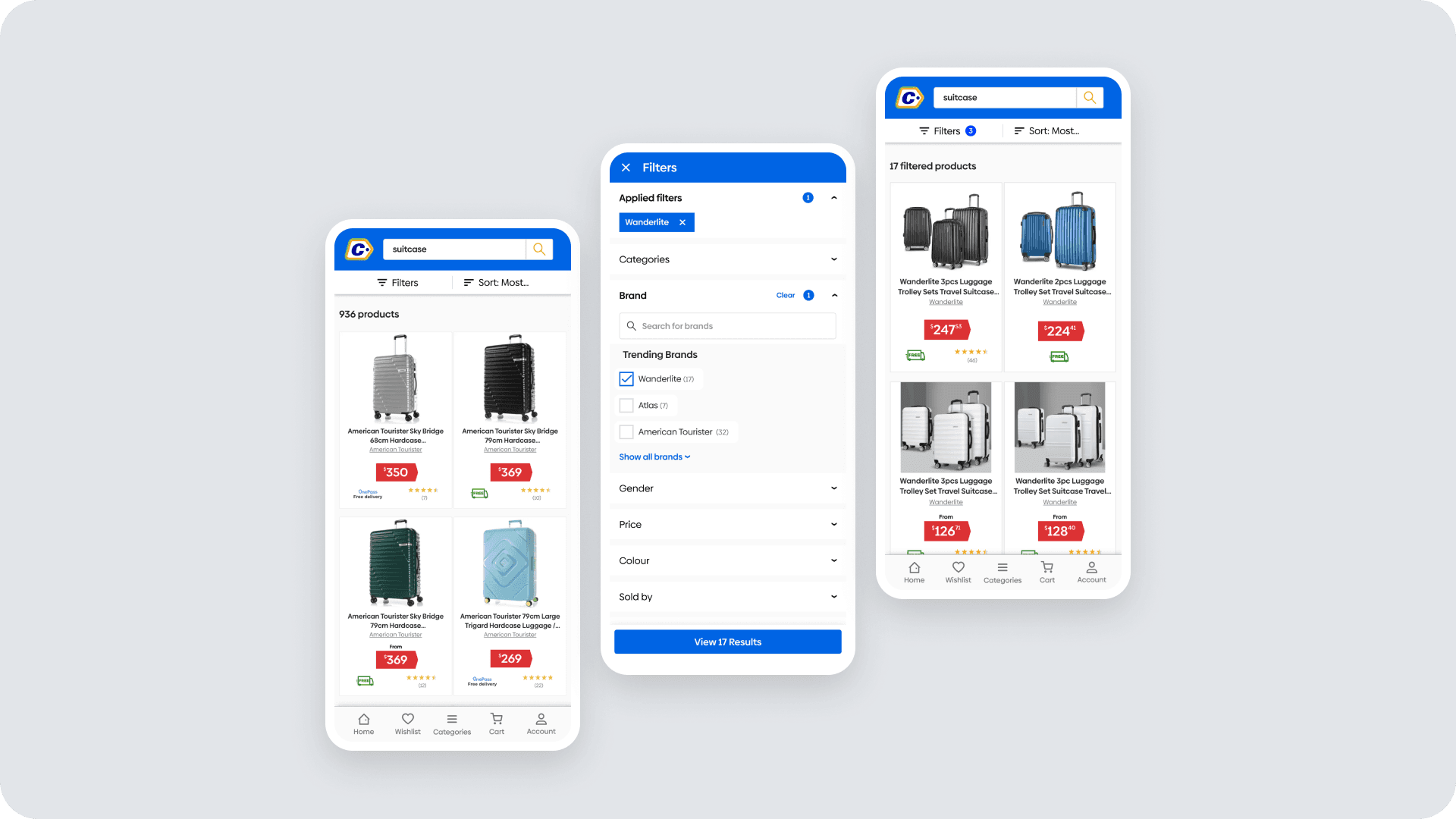
Catch’s legacy filtering experience had grown organically as the business scaled quickly from daily deals to a full marketplace. Each platform—web, mobile web, and app—handled filters differently.
Customers described the experience as cluttered, inconsistent, and overwhelming.
Key issues included:
Filters appearing in different locations and formats
Poorly prioritised options leading to decision fatigue
No clear feedback when filters were applied
Accessibility gaps in both colour contrast and focus states
For an 8M+ product catalogue, this inconsistency had real consequences: lost sales, frustrated users, and declining confidence in the platform.
How I work - Collaborative by design
From discovery to delivery I led the process in close partnership with product, data, research, and engineering. I defined the research plan, hypotheses, and success measures, then facilitated co-design sessions to align decisions across disciplines. Working iteratively in sprints, we validated and refined the experience together — ensuring every decision balanced customer insight, technical feasibility, and business impact. It was a true cross-functional partnership where data informed design, and design sharpened strategy.
What Informed the Design
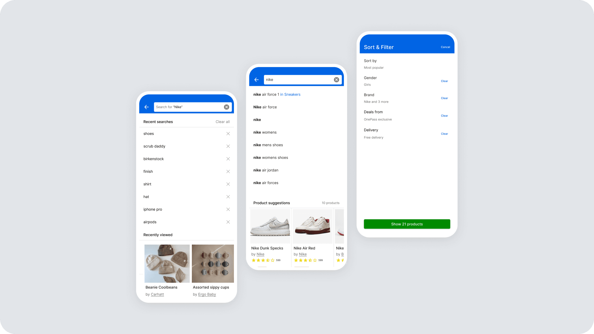
Analytics revealed that only a small fraction of users engaged with filters, yet those who did converted 50% higher — proving the experience was key to confidence and conversion. Two rounds of interviews uncovered three core shopper mindsets — Researchers, Bargain Hunters, and Browsers — each with distinct expectations around control and clarity. Benchmarking against leaders like Amazon, ASOS, and The Iconic reinforced best practices such as progressive disclosure, inline clarity, and persistent state visibility, shaping a faster, more intuitive filter experience.
Wireframing & Early Testing
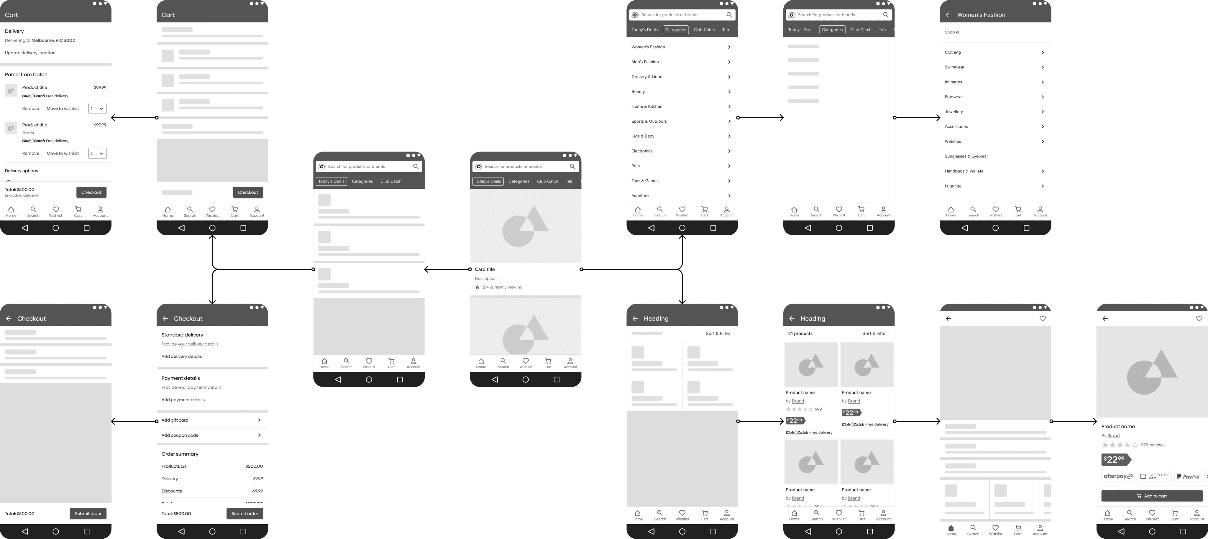
I prototyped early wireframes to validate core interactions and task flows through unmoderated testing. The sessions quickly revealed usability friction points and informed rapid design adjustments. This approach gave us fast, evidence-based feedback that strengthened both the UX and the confidence of the wider team before high-fidelity design began.
From insight to implementation
After synthesising data and qualitative insights, I built a findings and recommendations report categorised by tactical (immediate UI fixes), mid-weight (restructured filter hierarchy, grouping logic, and control types), and strategic improvements (full platform alignment, unified design tokens, and accessibility standards baked into the design system).
Each recommendation was prioritised and handed off through collaborative backlog refinement sessions, ensuring alignment across dependent squads (Search, Catalogue, and Native App).
Impact
Within two quarters of release, measurable business and customer outcomes followed:
$16.4M
Incremental revenue
A clearer, more consistent filtering experience across an 8M+ product catalogue removed the friction that was costing sales — customers found what they wanted faster, and converted more often.
18%
Boosted conversion
Conversion rate rose 18% overall — shoppers who engaged with the new filters were 68% more likely to convert than those who didn’t.
-21%
Reduced drop-off rates
From 48% to 27% we successfully paved the way for a better, more intuitive and useful filter experience
New search & filter experience
Final observations & learnings
The hardest part of this project wasn’t designing the filter UI — it was rolling changes out across three platforms (web, mobile web, app) that had grown apart, without freezing any one of them while the others caught up. Splitting the recommendations into tactical, mid-weight, and strategic tiers was what made that possible: it let quick fixes ship immediately on each platform while longer-term restructuring and accessibility work moved through the Search, Catalogue, and Native App squads in parallel, on their own timelines.
That experience sharpened a skill I still rely on: breaking a large recommendation set into dependency-aware tiers so cross-squad work can move at different speeds instead of all waiting on the slowest team.
I’ve used that same tiering approach on every multi-squad project since.
If I were doing it again, I’d sequence the accessibility fixes earlier rather than folding them into the strategic, longest-running tier — colour contrast and focus-state issues are exactly the kind of thing that’s easy to defer when bundled with bigger systemic work, and a couple of platforms ran with inconsistent accessibility behaviour for longer than I’d have liked during rollout.
Leading this initiative showed me how strong design systems thinking, coupled with curiosity and collaboration, can unlock both customer delight and measurable business growth.
“Making complex simple, and simple delightful” — this project was a living proof of that philosophy.

Alex Pacheco
Lead Product designer
If you like what you see or have any questions, feel free to send me an email anytime.
Selected work
[2022 -2025]

National Australia Bank
Making money management effortless
Catch
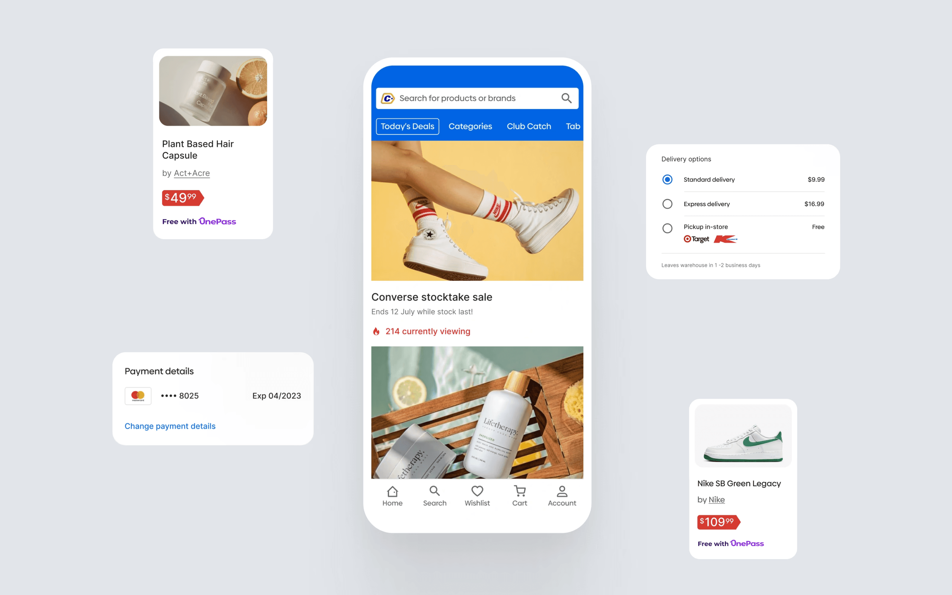
Helping Australians shop with ease
ULO
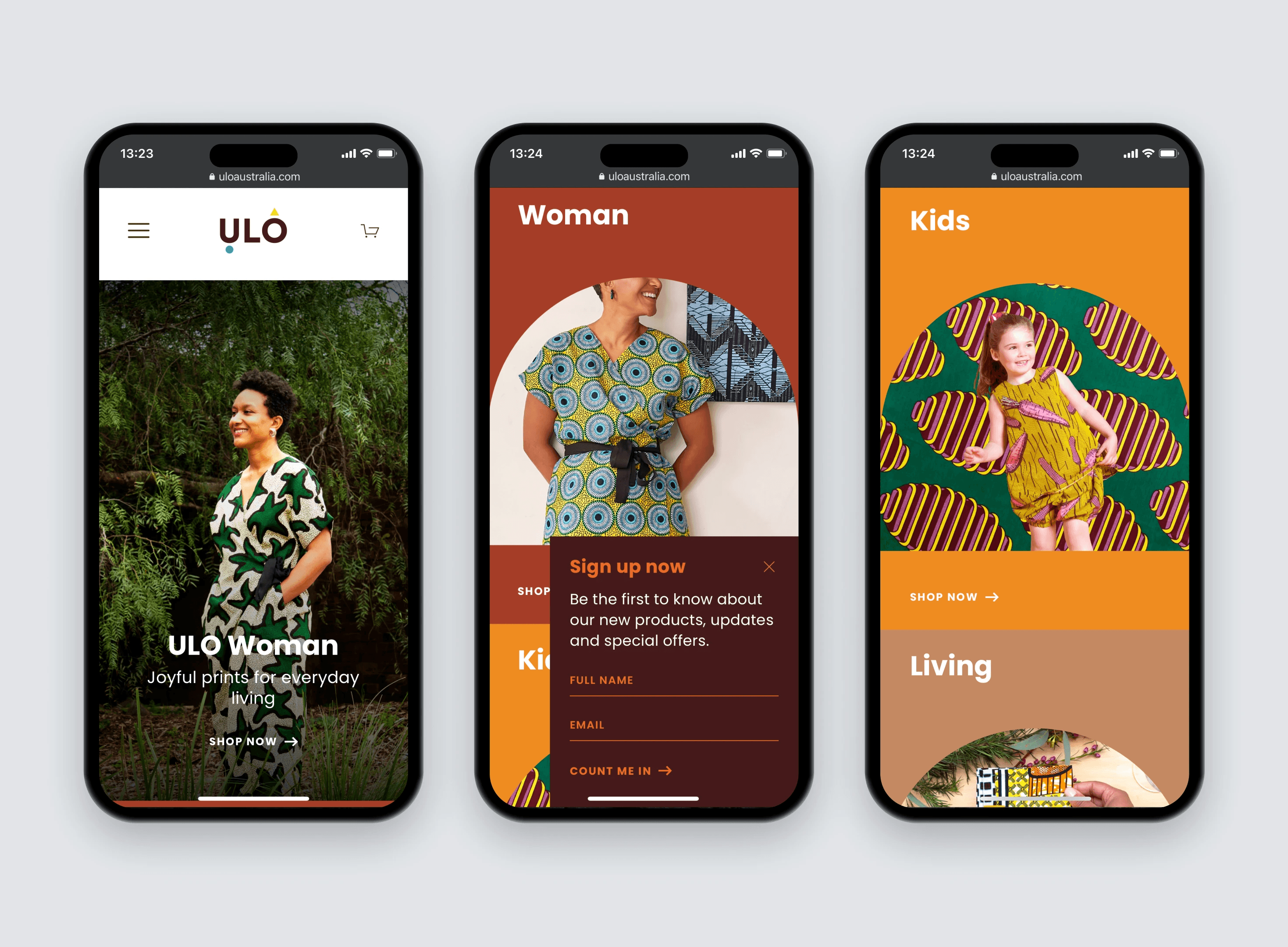
A playful e-commerce site
CBRE Growth Platform
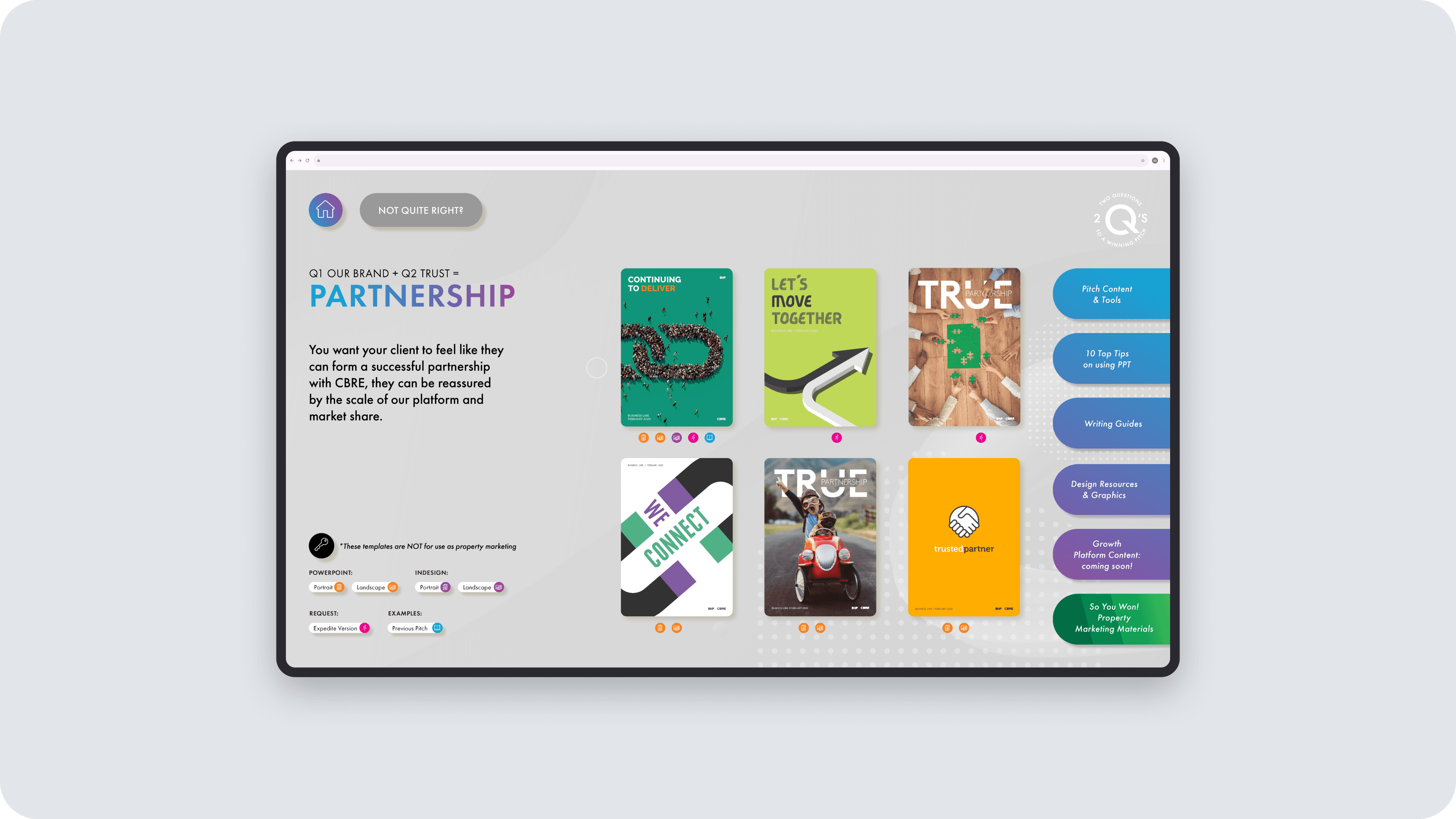
Two questions that changed how brokers pitch
