Making money management effortless
App & Web design
B2C
Financial Services
Overview - The rising cost of living crisis
Some of NAB's customers were struggling to understand where their money was going, how to stay on top of bills, and how to plan for the future with confidence. With existing banking tools being fragmented, transactional, and often too complex to be helpful.
I set out to reframe the problem — moving from isolated features to a connected ecosystem providing customers with clarity, confidence, and control. By combining research-driven insights, cross-functional collaboration, and taking a systematic mindset I delivered a scalable experience across NAB’s digital channels.
*none of this work happened under ideal conditions. Everything we designed had to work with legacy systems, and a timeline that shifted to run in parallel with a separate mobile app refresh that carried its own dependencies. I pivoted quickly working in two-week sprints, sharing insights and validating findings as both work-streams progressed.
I’ll take you through how we translated those challenges into a holistic money management platform that positions NAB not just as a bank, but as a trusted financial partner in people’s everyday lives.
Services
Lead UX/UI Design, design system, design leadership.
Client name
The National Australia Bank (NAB).
See Spaces on nab.com.au
Results at a glance
+28% engagement with digital money tools post-launch
3× more savings goals created and actively tracked
1.2M customers using insights each month to make faster decisions
Solution
From complex money management into a simple, connected ecosystem of tools designed to help Australians feel more confident and in control of their money:
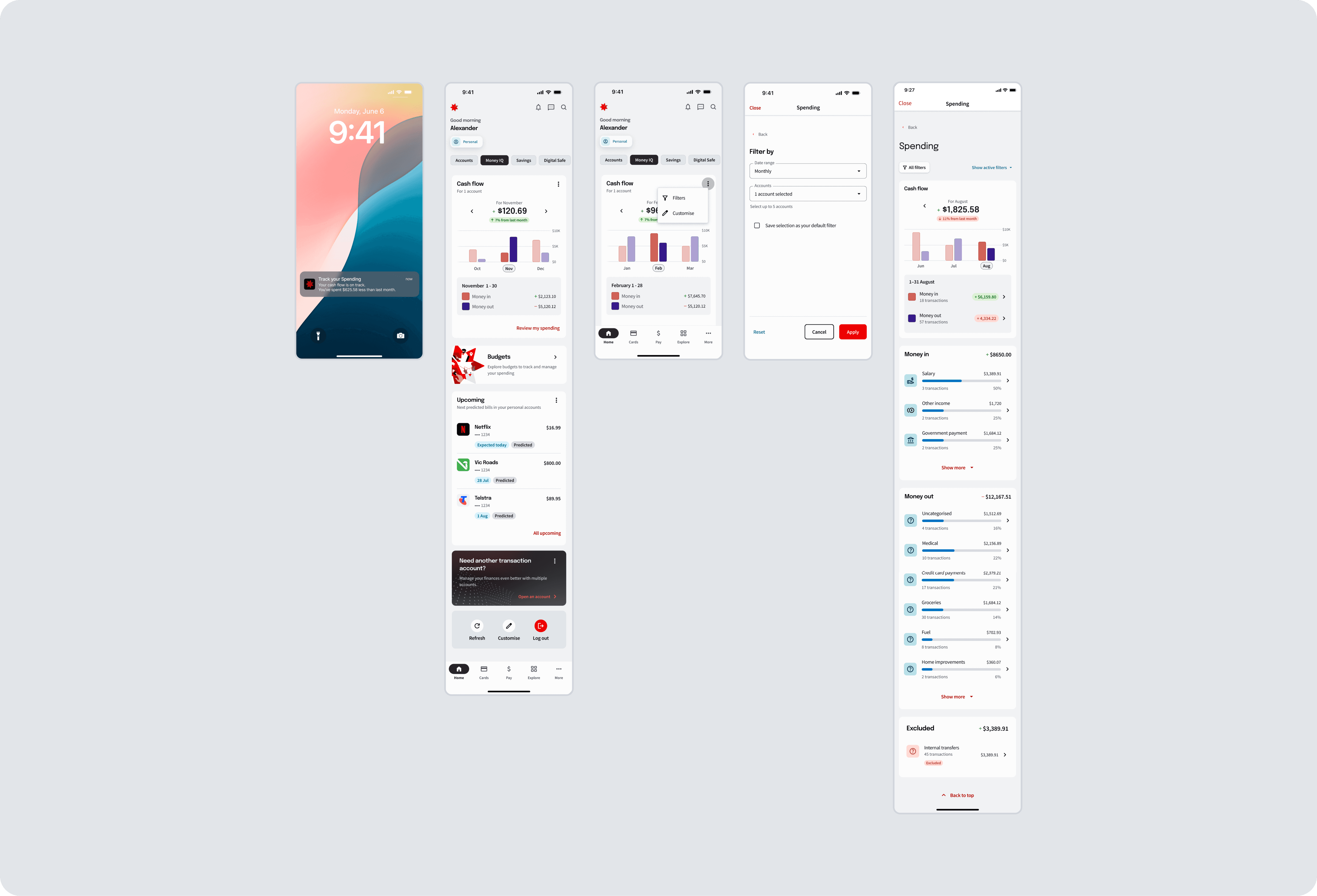
Cashflow & Insights — glanceable charts, monthly trends, predictive balances
Budgets & Spending — clear progress indicators to stay on track, suggested controls for discretionary spending
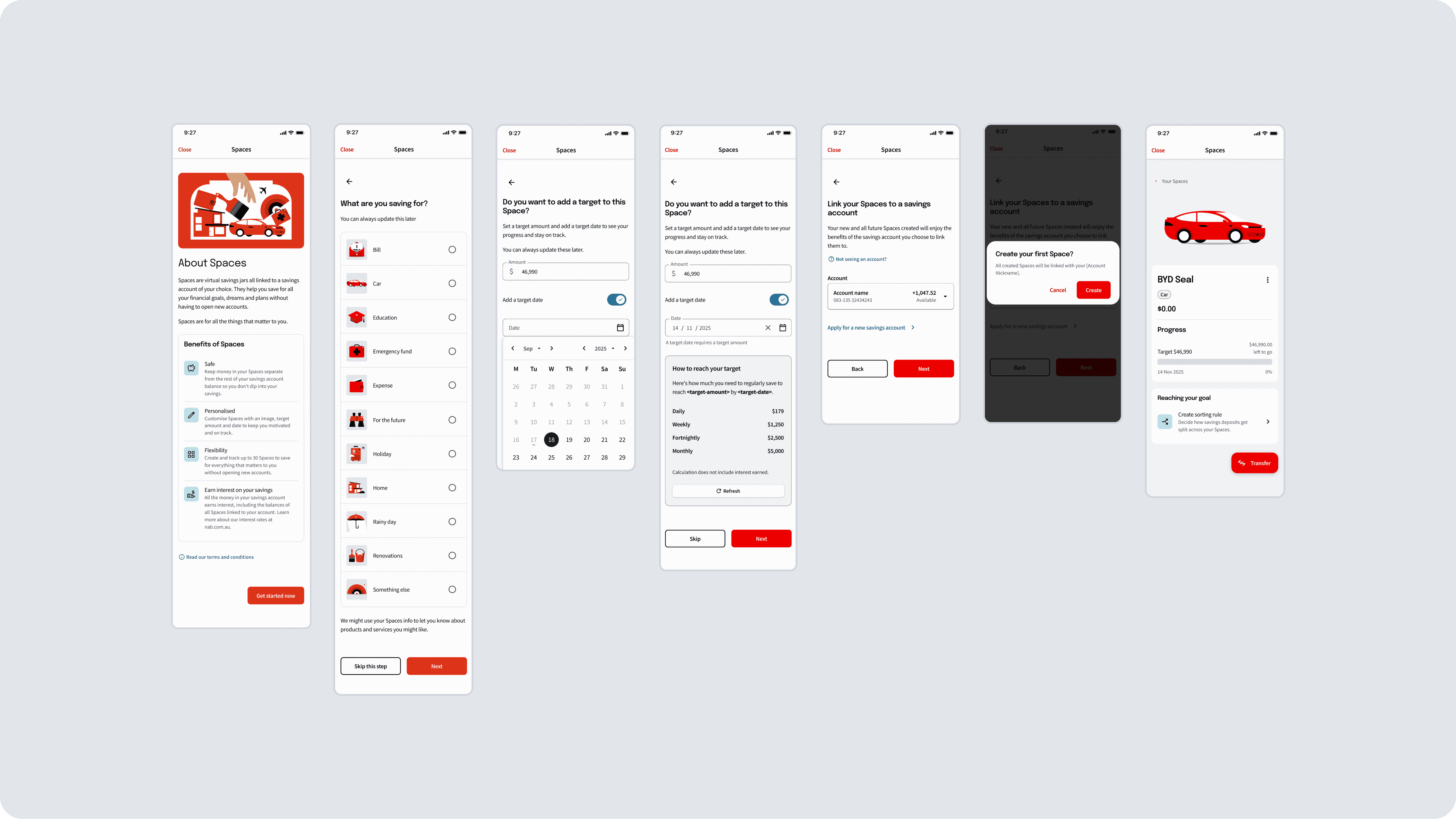
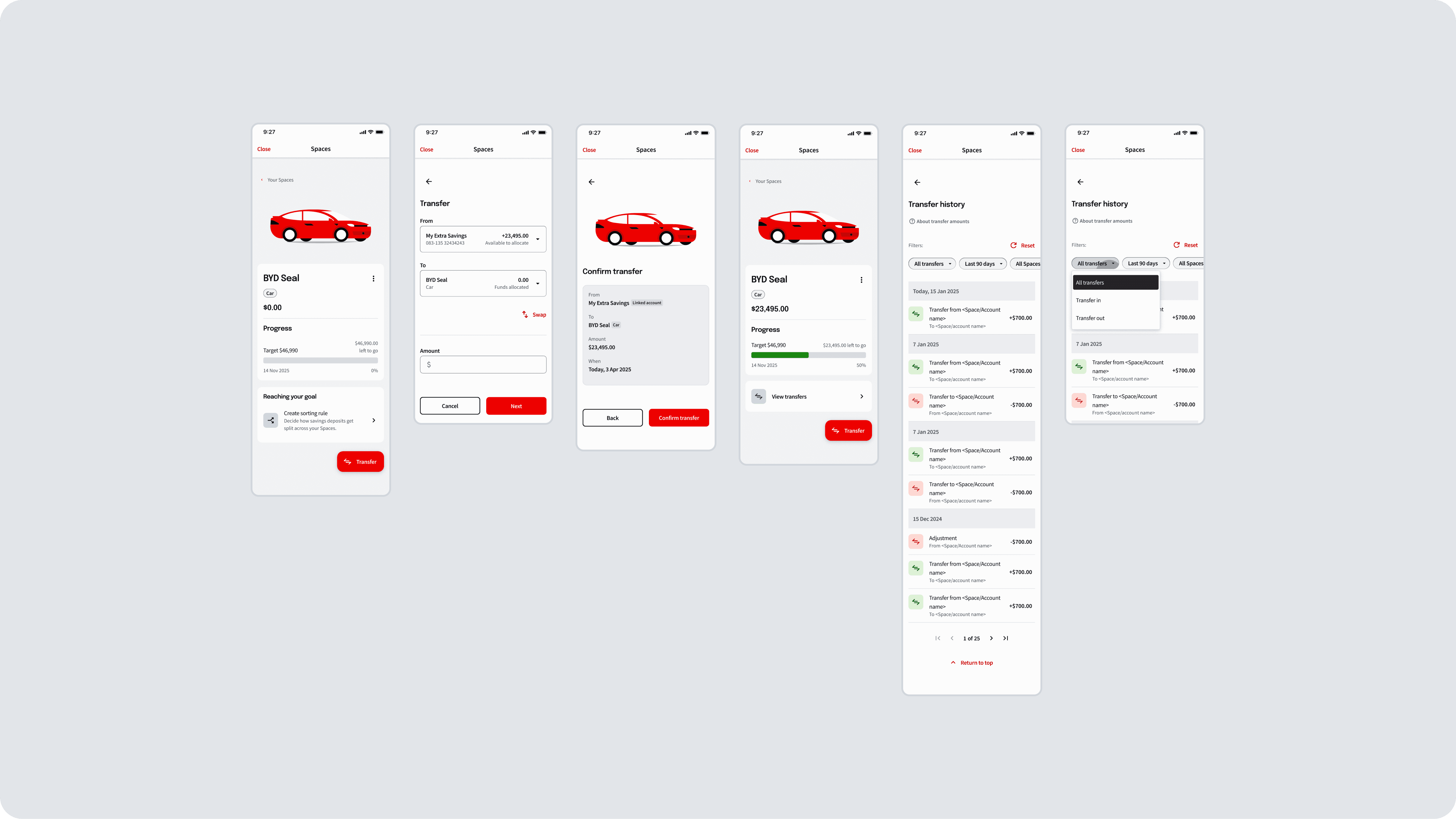
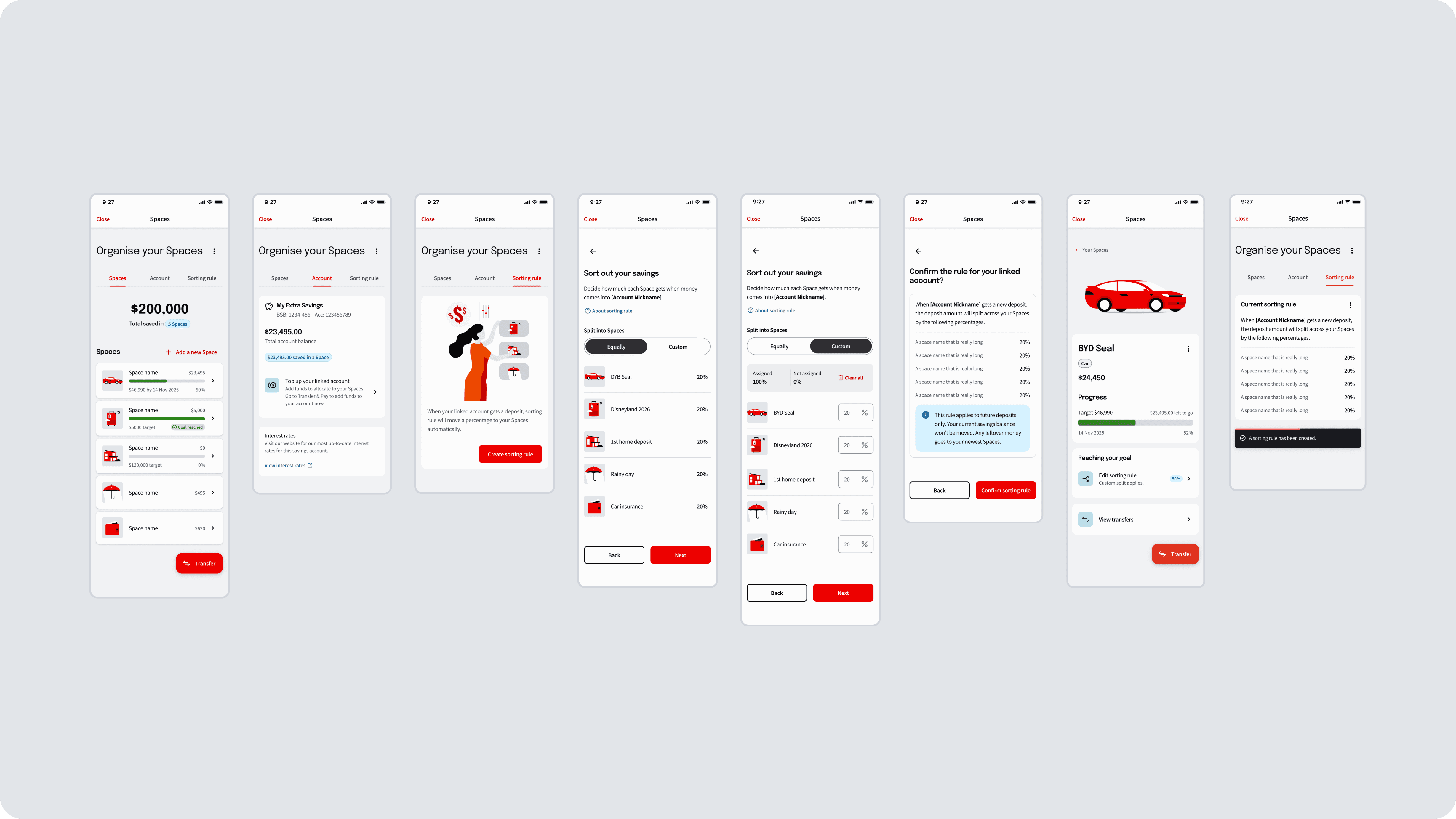
Saving Spaces — flexible jars with milestones, nudges and visual meter-style progress bars
Upcoming Bills & Subscriptions — proactive reminders, fewer surprises
Monthly Reports — digestible snapshots reinforcing positive financial habits
How I work - collaborative by design
I don’t design in isolation, I thrive on collaboration. This project was built through constant collaboration with researchers, product owners, developers, and marketing teams. I facilitated workshops, tested ideas early, and welcomed feedback throughout. My approach builds alignment and trust as much as it builds interfaces and momentum.
Research-Driven
I synthesised Money Mindsets (behavioural profile), JTBD insights, and usability testing into actionable design decisions. How those insights shaped the work:
“I don’t know where my money goes.” → informed the cashflow chart.
“I set goals but lose motivation.” → led to milestones and progress bars.
Systematic + Creative
I extended NAB’s design system with modular, accessible components (progress list items, meter charts, glanceable tiles). This ensured consistency, WCAG 2.2 compliance, and clarity—while keeping the experience approachable, modern and clear.
Navigating Ambiguity
When the scope was unclear—was this a “feature” or a “platform”?—I pushed to define it before design decisions got made by default. I mapped how the individual pieces (cashflow, budgets, saving spaces, bills, reports) needed to work together over time, not just ship independently, and used that to make the case for treating it as a connected ecosystem rather than a one-off feature. That reframing gave stakeholders a clearer story to align behind and gave engineering a shared model to build toward. It also meant slower short-term delivery in exchange for a foundation that could scale — a trade-off I flagged early and revisited at each phase gate. The result was a connected experience for customers instead of isolated tools bolted together after the fact.
AI as a working partner
I used AI intentionally on this project, not as a novelty. It helped me synthesise research boards, JTBD themes, and usability findings into actionable decisions faster; it worked as a sounding board for pressure-testing design directions before I brought them to the team; and it was a hands-on tool for building and iterating on design-system components and prototypes. I treat it the way I treat any tool — most useful when directed critically, and never a substitute for judgment or the team’s expertise.
Process in four phases
1. Discovery
Synthesised research boards on budgeting, savings, predictive features
Identified recurring pain points: lack of clarity, poor tracking, low confidence
Defined opportunity areas aligned to NAB’s digital strategy
2. Design
Created data visualisation standards fit for financial contexts (charts, meters, progress)
Developed glanceable, modular components that scale across the app
Iterated through testing: simplified navigation, reduced cognitive load
3. Validation
Ran usability testing on cash flow navigation and savings creation
Checked accessibility: colour contrasts, aria-labels for interactive charts
Refined confusing legends and progress indicators based on feedback
4. Delivery
Partnered closely with engineering for feasibility and performance
Aligned copy and tone with NAB’s brand voice
Handover included specs, accessibility requirements, and design principles
Impact
This ecosystem redefined how NAB supports customers:
Made money management simple, glanceable, and actionable
Positioned NAB as a partner in financial wellbeing, not just a bank
Strengthened loyalty by helping customers feel informed and in control
+28%
Engagement
An increase in engagement with digital money tools post-launch. In August 2025 we had an average of 2380 unique visitors per day tapping 'Create your first Space' CTA.
3X
Increased savings goals
85K more savings goals created and actively tracked since launch. With $92m allocated to Spaces as deposits since go live in June 2025.
1.2M
Meaningful interactions
Customers using insights each month to make faster and better financial decisions. The business outcome: improved digital retention (bank of choice - measured when customers choose an addition product) and stronger customer trust (NPS).
"It's easy to navigate and I like the xtra functionality that you've added. I was going to open another account to save but I can now use Spaces instead"
"I love the Saving Spaces and the ease of payment options including linking to your contacts of payID…it's nicely laid out and easy to use"
Innovation Award 2025
Winner Best Digital Banking Initiative 2025
What the judges said (Awards website):
Saving Spaces by NAB empowers Australians to manage 30 savings goals within a single account. This mobile-first innovation simplifies saving, boosts financial outcomes and enhances digital engagement. By streamlining operations and replacing legacy tools, it positions NAB as a leader in intuitive, customer-centric financial wellbeing solutions.
Setup screens from our new saving spaces feature
Final observations & learnings
The hardest part of this project wasn’t the money-management problem itself — it was making good decisions while NAB’s legacy systems and a timeline that had shifted to run alongside a separate mobile refresh kept moving underneath us. Two-week sprints became the mechanism that made that workable: they forced misalignments to surface early instead of at handover, and they’re the reason legacy constraints and validation findings stayed visible instead of becoming a late surprise.
That experience sharpened a skill I now default to: running structured, short-cycle checkpoints across teams whose roadmaps aren’t fully in sync, rather than assuming alignment will hold on its own. I’ve used that same cadence on every project since where work depends on more than one team’s timeline.
If I were doing it again, I’d push for dedicated usability testing time earlier rather than letting some of it run concurrently with build — the parallel timeline meant a couple of navigation issues surfaced later than I’d have liked, and we fixed them post-launch instead of before. It didn’t change the outcome, but it’s the clearest thing I’d change next time.
The result: Australians saving more, spending smarter, and trusting NAB as their financial partner for the future.
See the Linkedin post about this

Alex Pacheco
Lead Product designer
If you like what you see or have any questions, feel free to send me an email anytime.
Selected work
[2022 -2025]

National Australia Bank
Making money management effortless
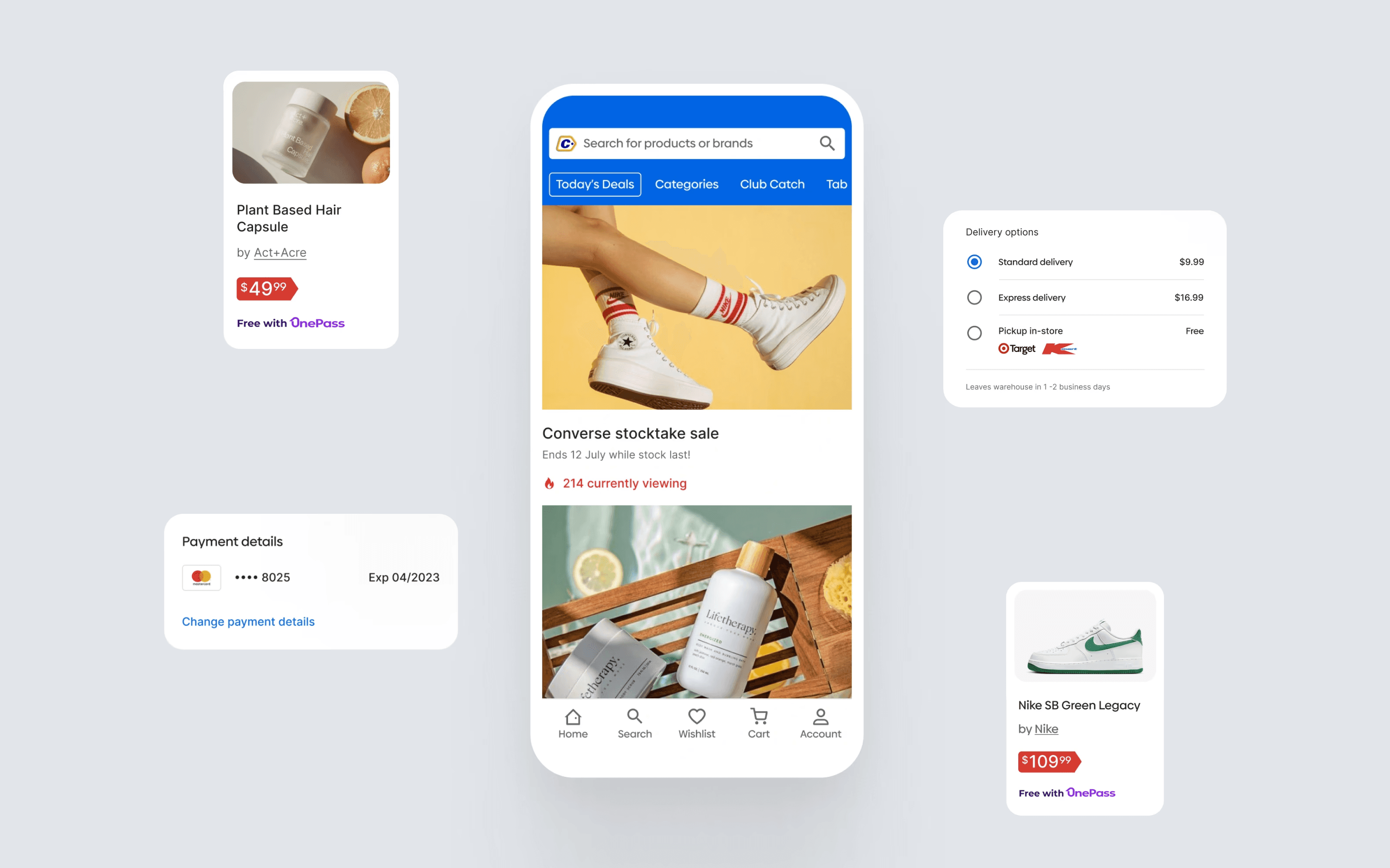
Catch
Helping Australians shop with ease
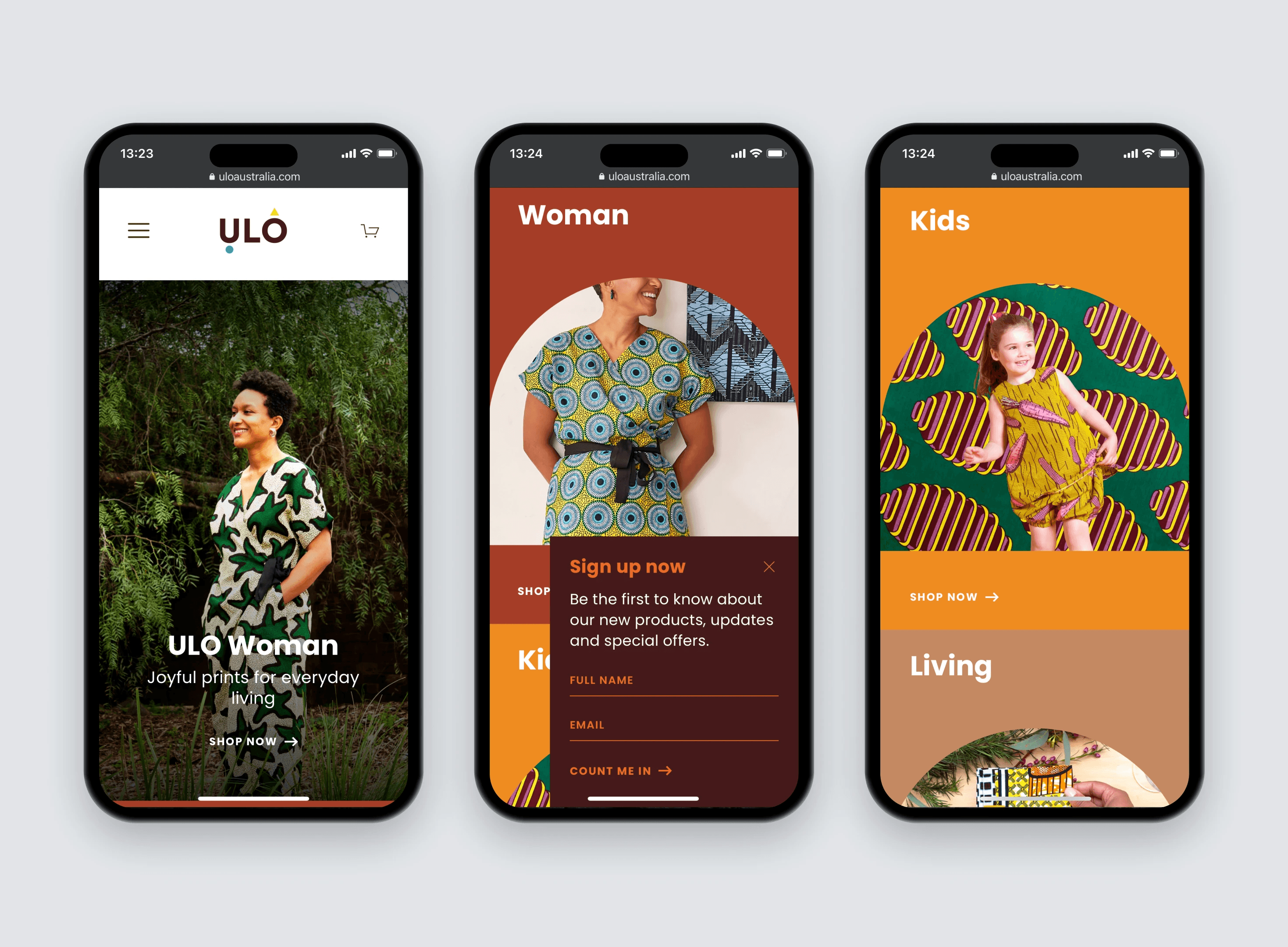
ULO
A playful e-commerce site
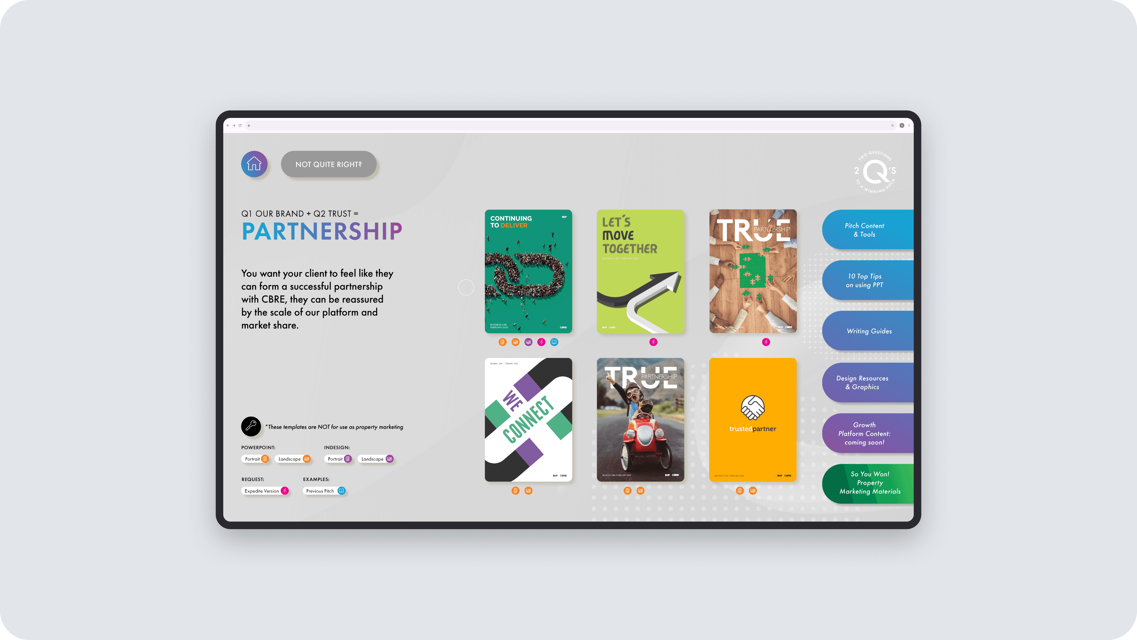
CBRE Growth Platform
Two questions that changed how brokers pitch
